UI Design and Other Things I'll Ramble On.
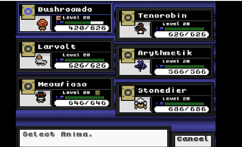
Apologies for the quality since I can't turn the full screen game into a gif, but here's basically how the Party UI's looking like. Main thing that makes UI design so difficult is frankly the fact that you have to compromise giving information, and since this is an RPG then it's a lot of it, with aesthetics. The party UI itself is working as expected as aside from showing the numerical values clearly and concisely it's also displaying other info via icons well enough for the player to understand. If you look at Bushroomdo and Meowfioso then you'll clearly see that the former is burned while the latter is holding a charm from the icons. In fact, the charm icon is also present in battles so you will be able to tell if an opponent Anima is using a charm or not. This is basically what my philosophy of being clear when it comes to giving the player information is all about as RPGs are very much about strategizing and stat crunching, and you can't do this if you're completely blind to what's happening in the game.
I'm not sure whether players will enjoy or dislike the evolution levels being in the summary screen as on one hand it does do away with needless time wasted making visits to a wiki, but on the other hand it also spoils the name of the evolved forms of the Anima. I'll think more about this when I received feedback on it.
I've decided to go more in-depth with the mechanics that I'm making, as in the Potential and Stat Allocation systems seen in the third and fifth squares, in game for the tutorial as I want the player to be aware of the more advanced systems in the game outside of things that generally are common-sense such as Elemental advantage. It's really not that much of a break from that genre but they do give the player more flexibility than the usual stuff seen in mon games like the EV or TV systems while at the same time encouraging players to side-quest.
Leave a comment
Log in with itch.io to leave a comment.